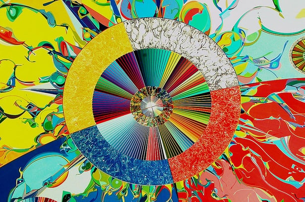
“Do you want to print your brochure in 4 color?” “No, I want to use all the colors.”
This exchange between a print expert and a tech company CEO took place a few years ago. It points out that what may be a common term for a printer isn’t necessarily common to a customer.
When a printer says “4 color,” he or she is referring to the 4 process colors used in combination for reproducing photos, illustrations and other images. These particular colors are Cyan, Magenta, Yellow and blacK and are abbreviated “CMYK.”

A lot of marketing professionals handle their company’s printing needs and have to deal directly with printers. If you’re new to the ‘printing party,’ you might hear a lot of words and phrases that are foreign to you. Don’t be afraid to ask what they mean.
Here’s just a smattering of common terms used in printing that marketers should be familiar with.
Bleed – Pick up something printed that has total ink coverage – meaning there’s no border of white anywhere along any edge of the paper. What you’re seeing is a “full bleed.” It describes ink coverage that goes right to the very edge of the paper. The ink “bleeds right off the sheet.” It may or may not cost you more to get a full bleed, BTW. Check with your printer.
CMYK – As noted above, this refers to the 4 process colors used in 4-color printing. C is for Cyan (blue); M is for Magenta (red); Y is for Yellow; and K is for blacK. Printers will talk about 4-color printing, full-color printing, or even process printing. They all mean the same thing.
Offset – This means two different things in the industry. First, offset lithography or offset printing is the most common method of commercial printing. Ink is transferred (or offset) from a printing plate to a rubber cylinder and then to another cylinder that holds the paper. The term is also used to describe a situation that results when printed sheets are stacked on top of one another as they come off a press, and the ink “offsets” from the top of one sheet onto the bottom of another. Sometimes this is also called “setoff.”
PMS – This stands for Pantone Matching Systemâ, which is the standard ink color system used by commercial printers. There are thousands of PMS colors to choose from. You might have a PMS swatch book on hand already. It’s a fantastic and critical tool for print customers. Check out www.pantone.com for all sorts of interesting color information. Pantone does color forecasts, a neat color blog, and color trends.
Spot colors – If you want to use a specific color (or colors) that isn’t a blend of CMYK, you’ll specify a particular spot color for your printer to print. Many corporations have logos that are a specific spot color. It’s also known as a “flat color.” You’ll use a particular PMS color – hence the need for the swatch book.
KO’s or reverses – This describes type or imagery that reverses out (‘knocks out’) of a surrounding area that’s printed. Two things to be mindful of: 1) fine type or line art can be difficult to reverse out of a solid, and 2) make sure the ink used when you’re doing a KO is dark enough to provide sufficient contrast.
Ganging – Printers can make the most out of a sheet of paper by "ganging" jobs; that is, by printing multiple jobs on a sheet at the same time. It’s a good way for customers to save money. Ask your printer how.
Chokes and spreads – Overlap of overprinting images done to avoid color or white fringes or borders around an image’s detail. It’s called trapping in digital imaging systems.
Creep – AKA “push out,” this is the distance that margins shift when paper is folded and/or inserted during finishing. The amount of creep will vary depending on both the number and thickness of the sheets and must be compensated for during layout and imposition.
Soft proof – This refers to a proof viewed on a screen, as opposed to a hard proof, which is a physical proof you can hold in your hands.
Remember that printing’s a manufacturing process with its own language. The more print you’re responsible for, the more you need to understand certain terms. If you’re in it for the long haul, you might want to pick up a copy of Pocket Pal by International Paper, and Getting It Printed by Mark Beach and Eric Kenly.
Of course, your own printer is your #1 resource for explaining the process to you and offering suggestions for making your project more efficient, creative and dynamic. Never hesitate to ask questions!
Want more info? Learn more print acronyms here.
Image by Jim Crocker with creative commons licensing.

